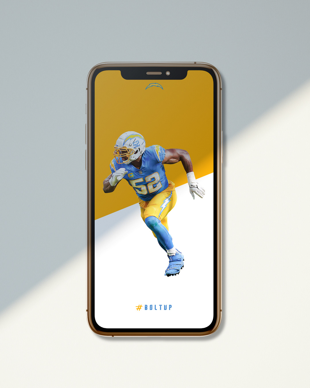
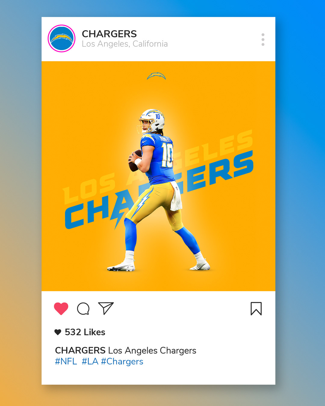
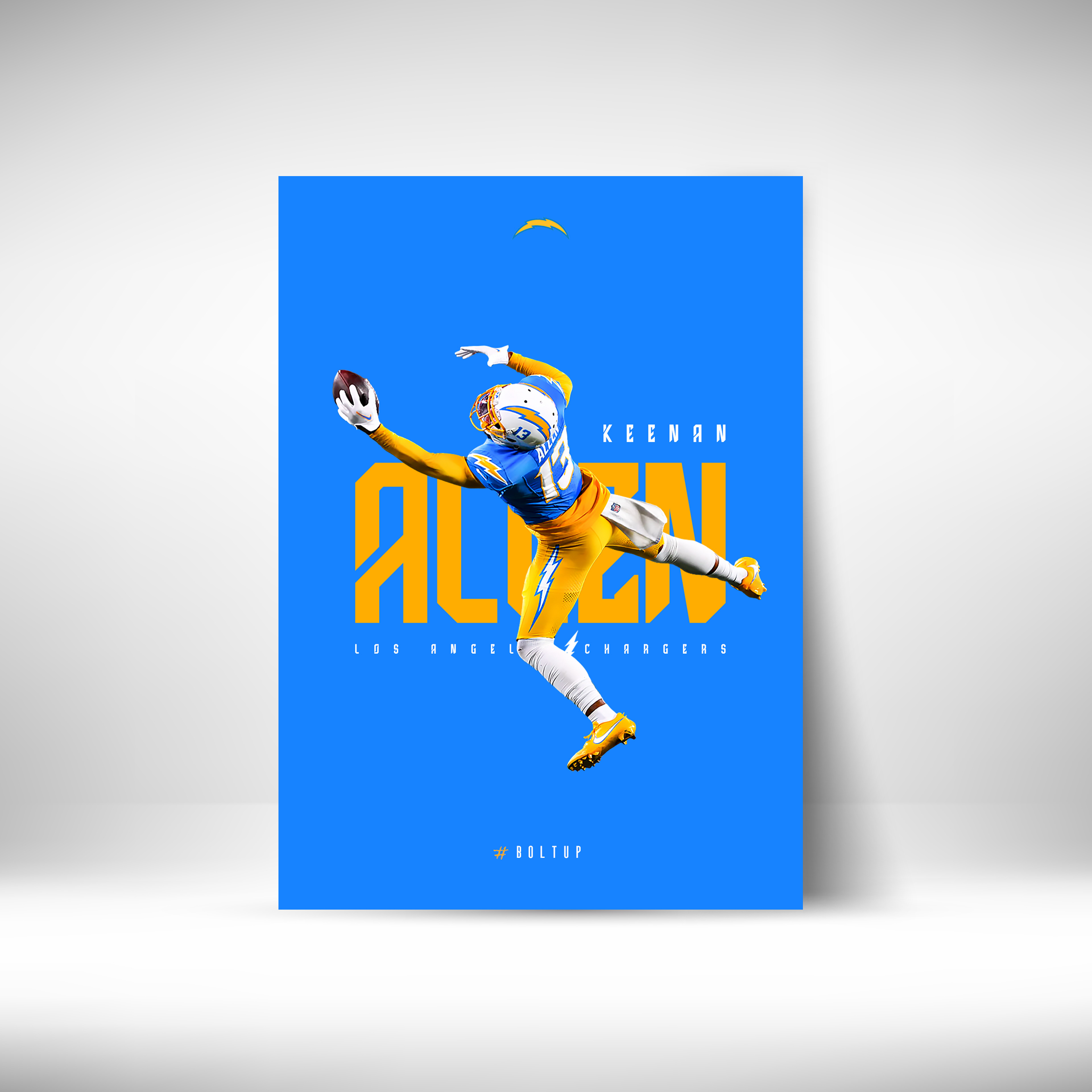
The poster use a solid background color that makes the main subject pop without too much visual clutter.
Using the team colors makes it easy to spot who it’s about right away.
I picked a font with sharp edges because it reminds me of the team’s bolt logo.
The design is all about clear, impactful visuals with just the right touch of team spirit.


